Pages
Tuesday, 1 March 2011
Rone Design
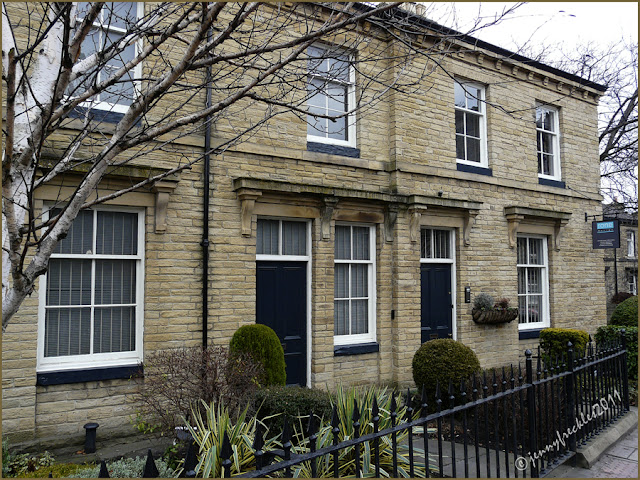
This is the attractive building in Saltaire that yesterday's lighted window came from. The building, once a house (or two) and now an office, is situated at the junction of Victoria Road and Saltaire Road, opposite the Salts Hospital building. It is beautifully cared for, kept very smart and the tiny garden is nicely designed too. It gives a me a little lift of pleasure everytime I pass by - day or night.
I suppose if you are an architectural consultant and interior designer, then you would want your home-base to do justice to your brand. The company, Rone Design, has occupied these premises since 1989. I don't honestly know much about them but they obviously work in partnership with architects and other professionals on new building projects and renovations, acting as project managers, quantity surveyors and consultants. Read about them on their website. It's vital that Saltaire continues to attract and keep businesses, as well as being a residential area. An architectural consultancy seems to fit neatly within the ethos of Saltaire as a creative, arts-based community.
------
Thanks to Stacy at 'Microcosm' for your kind words and link to my blog. I think it's time listed a few more of my favourite blogs, so where better to start than 'Microcosm' - 'a blog that explores the beauty that can exist in restricted circumstances'. Given that I tend to focus much of the time on a very small patch of the globe here in Saltaire, Stacy and I - for different reasons - share something in common, looking at the detail close round us rather than at the bigger picture.
Subscribe to:
Post Comments (Atom)


The lines of this building are perfect in harmony and elegance as well as in simplicity.
ReplyDeleteBeautiful and so well kept.
ReplyDeleteThe brickwork on this building is especially attractive and I can see why you 'get a lift' each time you walk by, Jenny. It really is lovely and so beautifully maintained. It makes me want to stand and gape a while to take it all in :)
ReplyDeleteVery neat and well built. These are smart looking offices.
ReplyDeleteI've had a quick look at Microcosm and will be returning for a longer visit when I have more time. Looks good.
they are indeed quite magnificent buildings and quite a relief that they haven't been knocked down to make room something 'modern'.. take care, love Judyx
ReplyDeleteOne of the things I especially like about your blog, Jenny, is that you do focus on detail. Always a pleasure to look at your photos.
ReplyDeleteJenny, thank you so much for your own kind words and link - on yet another of your lovely posts. Like Cranberry Morning, I enjoy the details in your photos and descriptions and the way you always see with fresh eyes.
ReplyDeleteI too know very little about them, but you are right and it is a pity that more of the buildings in the village are not as well looked after. I like their car too! Paul @ Leeds daily photo
ReplyDeleteFor some reason it could only be Yorkshire (Well, I think so anyway)
ReplyDeleteI also get a lift looking at places where you can see the bare ground right now! That is a rather pleasant looking place you get to pass by everyday. ~Lili
ReplyDeleteI agree! I would certainly enjoy strolling by that every day!
ReplyDeleteIt is an attractive building and nicely maintained. It would be a good enhancement to a walk.
ReplyDeleteCharming, indeed!
ReplyDeleteI find most English architecture quite attractive as this is.
ReplyDeleteAnd no, my camera is not that big! :) I usually use the camera I'm holding in my ID shot.